This issue of Pythoness Perspective was sent to newsletter subscribers. Browse all issues
Pythoness Perspective
Accessible design is care made visible — start with readable contrast
- From
- Amanda Nelson · Pythoness Programmer
- Reply-To
- help@pythonessprogrammer.com
- Sent
- Authors
- Amanda Nelson

I did not go looking for accessibility examples this week. My inbox handed me two.
First: a promotional email from Lush about a new app release. I opened it on my phone between tasks — the way most of us actually read mail.
The black header at the top? Readable. Fine. Then the body hit white type on saturated yellow and my eyes just… refused. I did not think “WCAG.” I thought nope — same email, same brand, one section that works and one that does not. Scroll down and the layout shifts to white on teal — suddenly I can read again. I saved both moments because I wanted to show you what I mean: contrast is not a niche concern, and inconsistency inside one send is how you lose people in the middle of the message.
|
Screenshot 1 — white on yellow (unreadable body; black header readable) 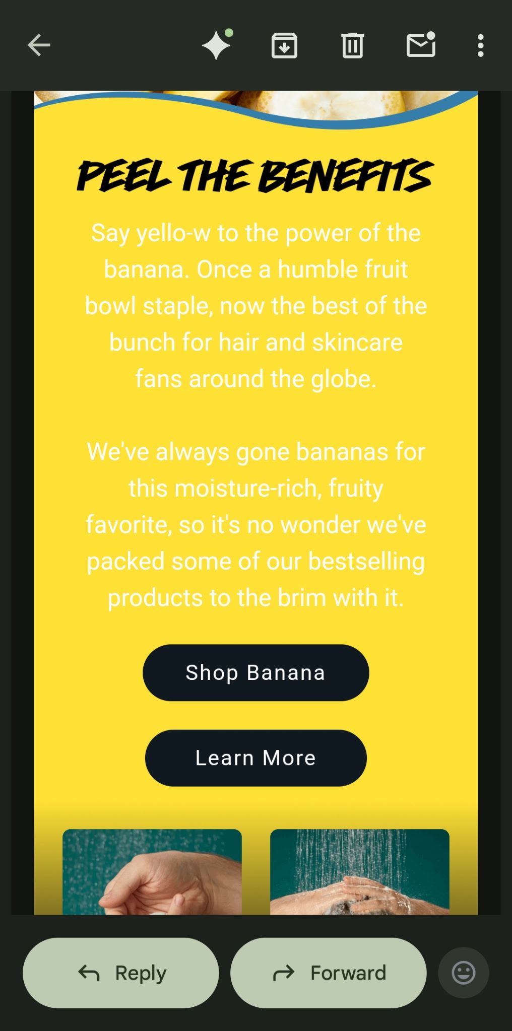
|
|
Screenshot 2 — white on teal (readable) 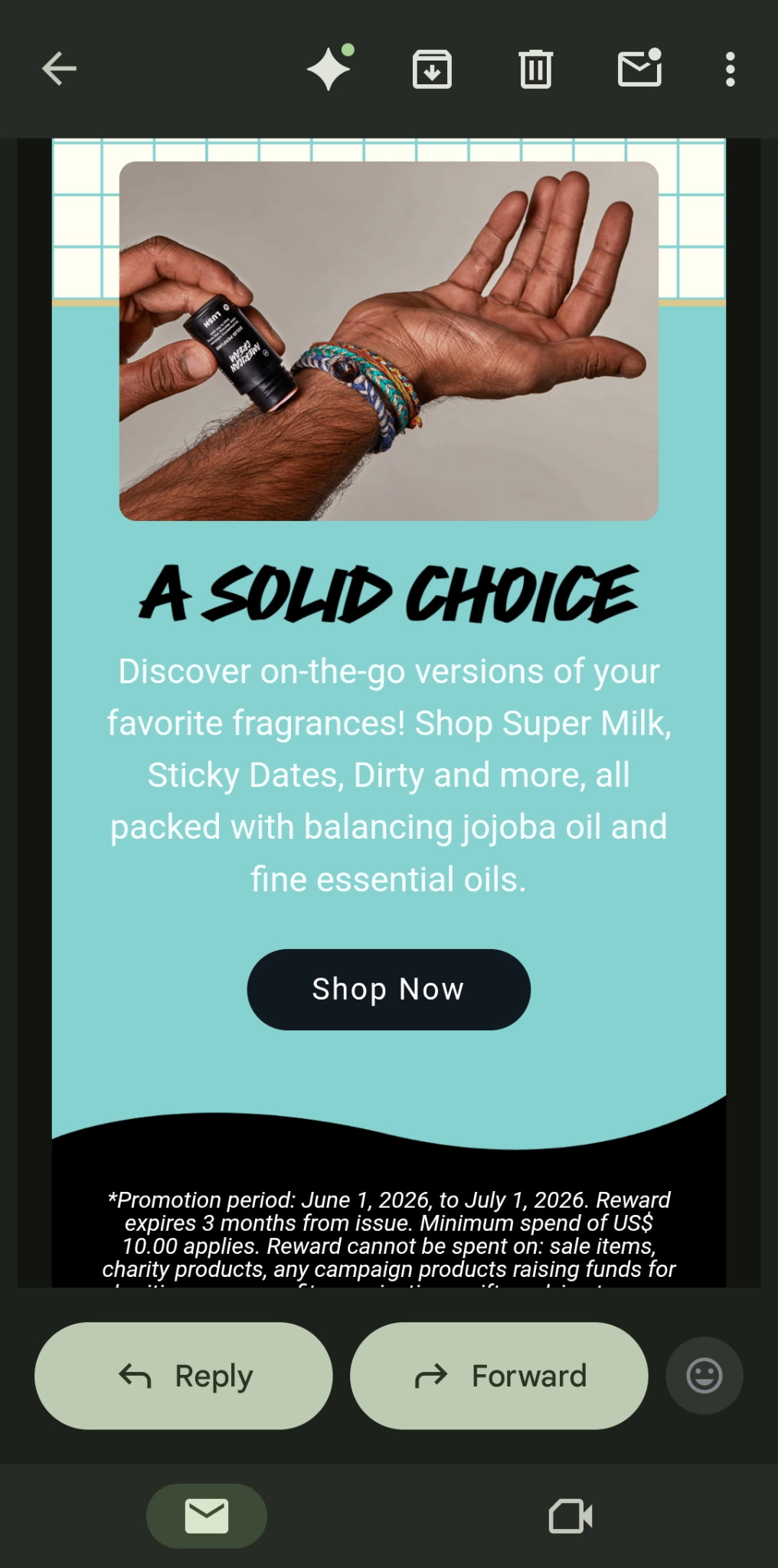
|
If it loses you in one section of a single email, it is already losing the people you are trying to reach.
Second: a colleague shipped a new newsletter with white text on a white background. The copy had been drafted and laid out with help from an AI agent — fast, on-brand in the abstract, and completely invisible to human eyes until it landed in real inboxes. They were mortified. So would I be. The tech ran. The workflow “worked.” Nobody’s eyes had been in the loop before publish.
That is this week in one sentence: automation and AI can scale your output, but only a human — looking at what another human will see — catches what looked fine in the builder and wrong in the inbox.
June picks up where May left off — on the Mindful Automation hub, readable contrast and a human touchpoint before every send or post. Details below.

~4 min read
This week: You own the readability of everything you publish at scale — site, newsletter, social, automations. Y.O.U.R. — Reach meets Fix 1: contrast + a human preview before go-live (especially after AI helps).
Do this today (10 minutes): Pick one surface (email, homepage, or pinned post). Open it on your phone. Contrast-check body text + main CTA (4.5:1, WCAG 2.1 AA). If an agent touched it, you are the final eyes.
May carry-forward: Mindful Automation — Y.O.U.R. Framework, automation as hospitality, human touch before send.
June depth: Neuroinclusive Design · five fixes this month: Accessible Tech Design.
Contrast tools: Start with WebAIM — full list in Tool Spotlight.
Next Friday, Jun 12: Scannable structure — same rule: human eyes before publish.
🔥 Fire Horse principle (Ship the Smallest Version That Serves): One human preview beats output that only looked finished in the builder.

Part 1: You Own What People Actually See (Y.O.U.R. → June)
In May we expanded Y.O.U. to Y.O.U.R. on the Mindful Automation hub — same three questions about your brain, your observations, and keeping things simple, plus R for Reach: Who is on the other end, and what do they need that they should not have to ask for?
The hub names something I keep returning to: automation is hospitality. When the tech talks for you, your client cannot see your dashboard. They only see what landed in their inbox, feed, or confirmation screen. Maya’s four-week thread there is full of gaps that looked “successful” on the admin side and confusing on the human side.
June adds a layer May did not spell out loudly enough: you are responsible for the readability of every piece of text your systems put into the world at scale.
Not your developer someday. Not the platform’s default theme. You — for the website, the newsletter, the promo blast, the Instagram template, the automated “you’re registered” mail, the PDF, the link-in-bio page. When volume goes up (more posts, more sequences, more AI-assisted drafts), your obligation to preview goes up with it. Reach is not only when something sends. It is whether a tired human can read it without zooming.
That is why my inbox mattered this week.
The Lush promo is a lesson in mixed contrast in one send — readable black header, unreadable white-on-yellow body, readable white-on-teal lower in the same message. Same brand, same email, different choices. My colleague’s newsletter is what happens when an AI agent helps with layout and nobody previews on a real device — white text on a white background, invisible until it is already sent. Easy mistakes. Fixable ones. The kind any of us can make when we trust the builder view and skip the inbox view.
A third pattern shows up in automated emails — the ones your system sends while you are doing something else. Someone registers for your workshop. The confirmation arrives: soft light-gray body text on a white background. It looked elegant in the email builder. On their phone, in daylight, they cannot read the event date without pinching to zoom. They do not zoom. The zap fired, your dashboard said success, and the human still did not have readable information. Same contrast problem, different channel.
Last year’s neuroinclusive design guide named the mindset: environments, not exceptions. Accessible design is care made visible — across every channel you touch, not only your main site.
The Y.O.U.R. question for this week: Is this readable for the brain on the other end — including mine, on my phone, on a bad day? If you are using agents to scale output, that question is still yours to answer.
Part 2: Human Touchpoint First, Then Fix 1 (Contrast)
Before anything goes out — post, email, Story template, automated trigger — run a short human review with accessibility first. Not after complaints. Not “when we have time for an audit.” First.
| Step | Ask |
|---|---|
| Preview like a subscriber | Phone, bright light if you can, rushed — not the desktop tab you have been staring at for an hour. |
| Contrast (Fix 1) | Can you read body text and the main CTA without squinting? Quick check: WebAIM — aim for 4.5:1 on normal text. |
| Agent pass | If AI touched copy, colors, or HTML — did it assume a background that disappears in some clients? (White on white is the classic.) |
| One fix, then send | Change the worst pair before schedule. Note hex codes so the next draft does not repeat it. |
Pick one surface this week
| You publish… | Start here |
|---|---|
| Business | Homepage, welcome email, pricing PDF, or checkout |
| Social / community | Pinned post, link-in-bio, Story text, Discord/Slack theme |
10-minute ritual: Open that surface on your phone → identify the one text pair that matters most → adjust contrast or weight → save the template.
Platforms you already use: Mailchimp, ConvertKit, Squarespace, Carrd, Canva, Instagram — no developer required.
Reflection prompt: Open your last three client-facing sends on your phone. Which fails the tired-eyes test first? If AI helped build it, start there.
I philosophize with other decolonizing neurodivergents about how our tech struggles reveal what we have internalized and what our brains actually need. May taught us to reach people well when systems run. June asks whether they can read you when those systems do. Human eyes. Accessibility first. Then send.

Contrast & accessibility resources
You do not need every tool — pick what matches how you work. All free unless noted.
| Resource | Best for |
|---|---|
| WebAIM Contrast Checker | Enter foreground + background hex codes; see pass/fail for WCAG AA and AAA. Start here. |
| Who Can Use | See how a color pair looks to people with different vision — helpful when you are choosing brand colors. |
| TPGi Colour Contrast Analyser | Desktop eyedropper: sample colors from a live site, PDF, or screenshot (Mac/Windows). |
| WCAG 2.2 — Contrast (Minimum) | Plain-language explanation of the 4.5:1 rule and when exceptions apply. |
| WAVE Web Accessibility Evaluation Tool | Paste a URL for a quick page scan (contrast is one of several checks). |
| Firefox Accessibility Inspector | Built into Firefox DevTools — inspect contrast on elements already on your page. |
| The A11Y Project Checklist | Broader than contrast; good when you want a sane “what else should I look at?” list. |
| Neuroinclusive Design hub | Five-minute accessibility check (contrast is step one) + design principles. |
Inside tools you may already use: Canva, Figma, and many email builders (Mailchimp, ConvertKit, etc.) include contrast panels — use them after you pick colors, then confirm once in WebAIM or Who Can Use.

Your tech struggles, reflected back.
This week's prompt:
Have you (or someone on your team) ever sent something where one section was readable and another was not — gray-on-gray, white-on-white, white-on-yellow, or a combo that looked fine in the builder? What would your “human touchpoint before send” look like?
Share on the site or reply to the newsletter — I read what you send.

🔥 The Fire Horse's Callout: What to Charge Forward With
The Fire Horse ships the smallest version that actually runs — not the version that only looks finished in the dashboard.
This week that means one send, one human preview, one contrast pair fixed. Not a full audit. Not shame about the agent. Proof that you still hold the line for the people on the other end.
🔥 Charge forward with: The next email or post you will open on your phone before it goes live — and the one color pair you will fix when you do.

WHAT'S NEXT
Next Friday, June 12: Scannable structure — still your responsibility across every channel, still human eyes before publish. Mindful Automation stays on the hub if you want to revisit Reach and the playbook.
If anything in today's issue landed for you, I would love to hear from you.
See you June 12.
— Amanda

Book a reflection session — 20min ($95), 60min ($255), or Async Project & Web Presence Reading ($75) → pythonessprogrammer.com/services
Browse free resources → pythonessprogrammer.com/resources · Mindful Automation (May) · Neuroinclusive Design
Leave a tip → pythonessprogrammer.com/support
Shop → stickyspells.etsy.com
Subscribe → Pythoness Perspective (weekly, March–November)
This issue was sent to newsletter subscribers. Sign up to receive the next one (weekly, march–november).
Pythoness Perspective
Weekly issues, March through November only. Each month is one arc—a deep dive through a tech sovereignty resource I teach, with practical steps each week tied to the same frameworks in my free guides and sessions.